
A New Era of Gas Monitoring Systems ⚠️
Sponsored by Industrial Scientific Corporation, we explored new and innovative ways of redesigning their gas monitoring system.
We created an interconnected system that allows each product to interface more seamlessly with the other while addressing specific points of improvement they each had.
I specifically focused on the Radius BZ1, looking to improve its durability and ergonomics.
Duration
7 weeks (April 2022- May 2022)
Skills and Tools
User Research
Physical Modelling
Rapid Prototyping
Solidworks
PLA 3D Printing
Keyshot
In collaboration with John Henley and Shaoting Yan

.png)
.png)


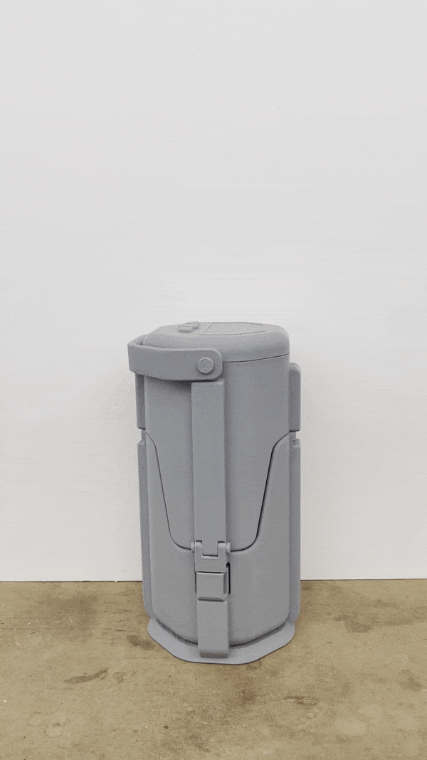
Exploded Diagram

Design Details

Deployment
Handle and Screen Details

Locking System

Alarm States

Product Research
We were invited to ISC to learn more about their product system and their users' needs and wants.


Our main takeaways were that:
1. Products were too bulky
2. Lack of distinct brand language ("brick" like)
3. Wanted more ergonomic consideration
4. Heaviness leads to frustration during use
For this group project, I took on the role of redesigning the Area Monitor Radius BZ1


My Role: Radius BZ1
To study it, I took the product apart to understand its materials and internal components
I also took note of its size and ergonomics, noticing that its low screen was hard to see, and its cone shape was awkward to carry
.png)
What were the paint points with the original Radius BZ1 and what did I do to address them?

User Studies
Next we looked at competitor products in the market and developed user journeys and personas to better understand our users
We asked ourselves:
What does a day look like for our user?
At what points in the day are they using the products?
What could they be like outside of work?
How do the products work as a system?
Could we streamline the system?


Initial Ideations
.png)
I took inspiration from soft geometric forms to combine a sense of robustness.
The Radius BZ1 is both an industrial product that needs to function well and a consumer product that has to encourage daily interaction


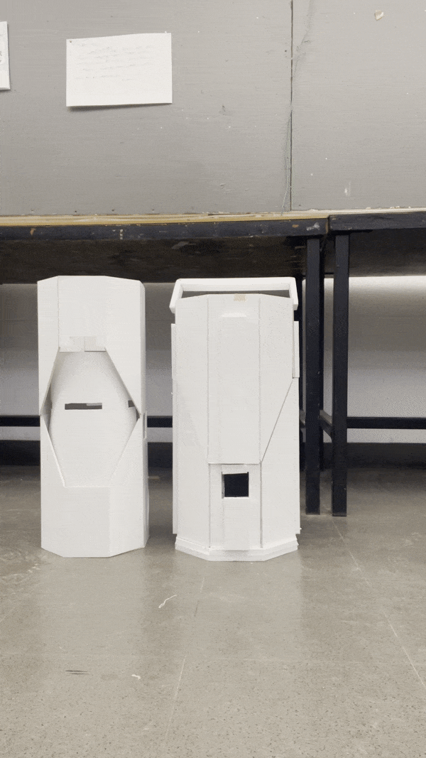
Since many of my ideas were mechanism heavy, I modelled them out both in 1/3 scale and full scale to test out movement and proportions


Eureka Moment
Initial spread featuring final idea and mechanims
Interim Presentation with ISC
We had a mid-project review with representatives from ISC where we presented our sketches and models while pitching a main system amongst the 3 products assigned
The goal of this presentation was to receive feedback on our working ideas.
"


From here, my main focus was to develop my overall form and work out details and mechanics.
I did through through more sketching, color explorations, and full scale models.
Form Development


As our team came together to discuss brand language and overall characteristics for each of our designs, we identified 3 descriptive words for ISC's brand
1. Robust
2. Honest
3. Safe
As a team, we worked using clay and other fast prototyping techniques to determine key features we would mirror across all 3 products.
To explore these words, I worked on more sketches, color explorations, and CAD modelling.


Visual Brand Language
From these, we focused on creating forms using simple geometry to communicate honesty but included iconic shapes for a distinctive brand.
We also designed features such as bumpers and mechanical clasps to communicate safety. As a system, we had an ergonomic focus with features and studies based on interaction.
Each of our designs used circles as areas of light or warning sources
.png)

Taking inspiration from consumer technology, we used circles and rounded corners to communicate interaction and make the products "friendlier".
While these are industrial products, people have to use them daily.
.png)

At the same time, keeping true to the industrial context these products are used in, we used sharper hexagon shapes to communicate roughness, and bumper-like black rims to show safety.
.png)
We realized that these are
"Consumer Products in an Industrial Context"

Reflection and Thoughts
This project was challenging in a refreshing way. It was a unique experience for us to work directly with a company and understand their product and users.
What was most important to me during this project was not about changing the product completely, but rather improve it in a way that best supports its users.
Working in a team for the first time on an ID project was also a lot of fun as we could help each other through the project and also receive feedback on our own work.
Currently working on finishing my full-scale print!
